In part 1 we put together the beginning of the design doc for our fictional case, the Inventory Replenishment Recommender: headers, overview, scope and context, goals, and non-goals. Now we get to the heart of the document.
⚠️ As always, the sections here are examples and recommendations, not a mandatory template.
The design Link to heading
A quick clarification: the “design” isn’t a single section, it’s a set of them. Depending on the project, it unfolds into several parts, each with its own heading:
- the solution itself (the overview and the details of the approach);
- context, architecture, and sequence diagrams;
- APIs, the data being handled, and its sensitivity;
- screens and payloads (when needed);
- pseudocode (rarely).
What ties all of these sections together is their purpose: given the context, the goals, and the non-goals, they show why a particular solution meets those requirements better than the others. Start with an overview and then dig into the details.
The trick is to focus on the trade-offs. That’s what produces a document with long-term value.
The design: overview
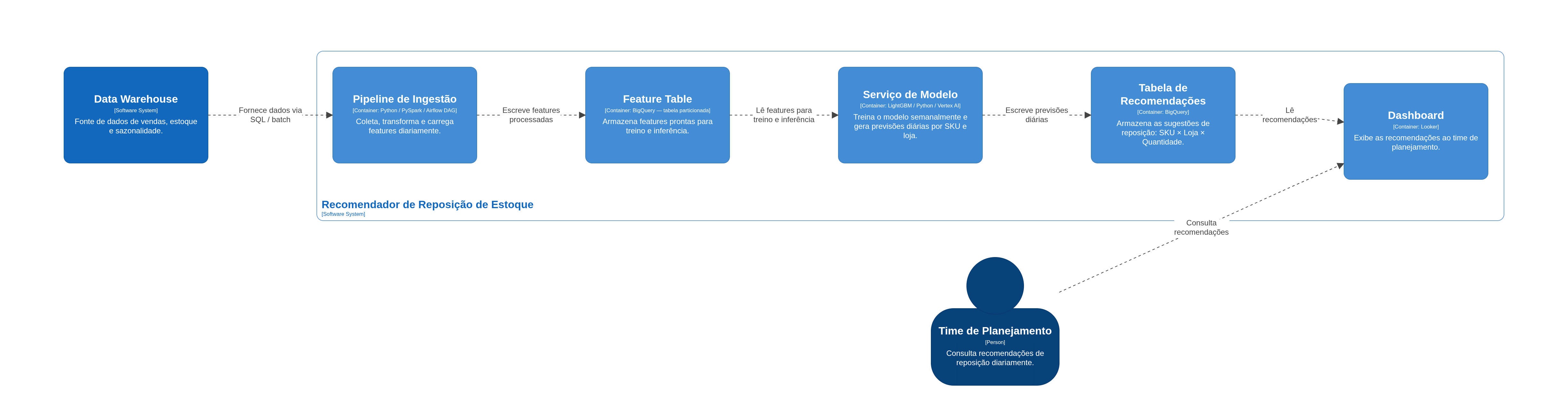
The system is made up of three main components: (1) a daily ingestion pipeline, (2) a training and inference service for the demand model, and (3) a recommendations table consumed by the dashboard.
The pipeline pulls sales, inventory, and seasonality data from the data warehouse and turns it into features for the model. The model is retrained weekly and produces demand forecasts for the next 7 days per SKU and store.
We chose daily batch over near-real-time given the business’s ordering pattern (daily). That cuts infrastructure cost by roughly 40% without affecting the SLA.
C4 diagram (container level) Link to heading
The C4 diagram at the container level shows the executable processes, databases, and how they talk to each other within the system. It’s useful for communicating the high-level architecture without getting into implementation details.
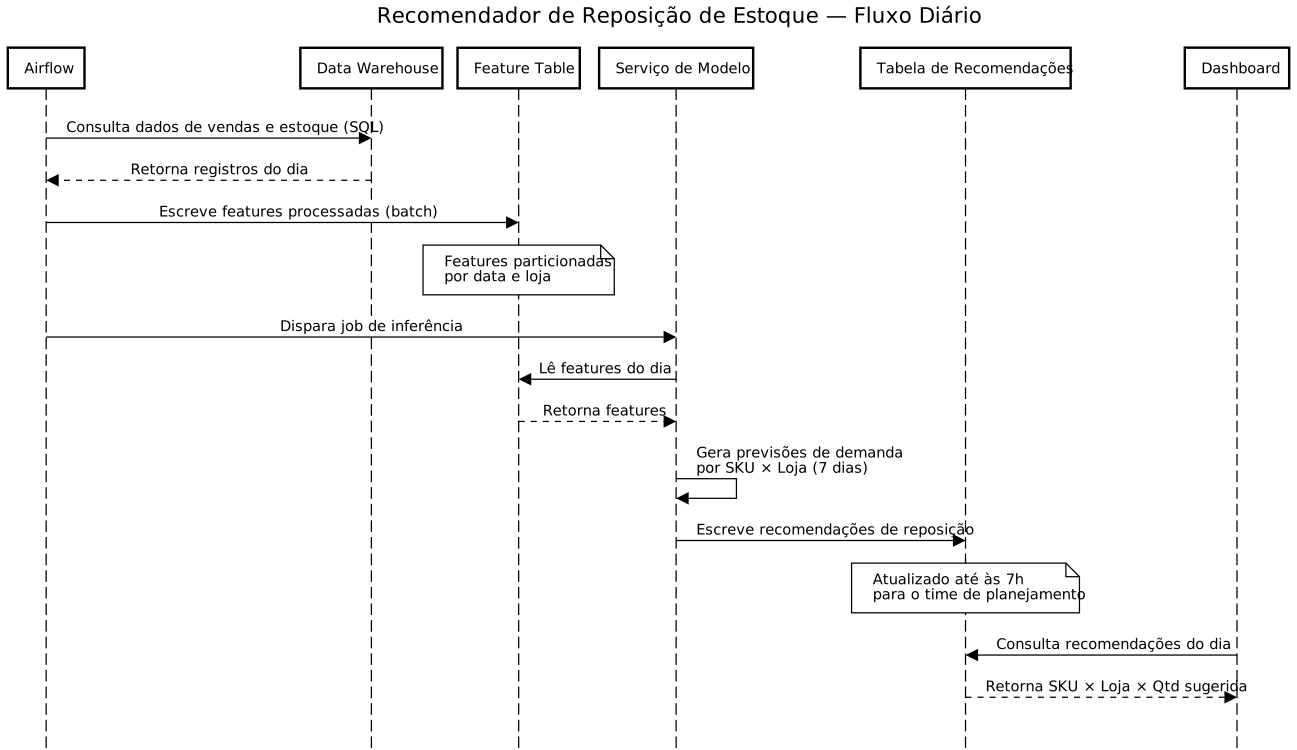
Sequence diagram Link to heading
Sequence diagrams show the order of interactions between components over time. They’re handy for documenting data flows, API calls, and batch processes with timing dependencies.
The trade-offs of the chosen solution Link to heading
Every design involves trade-offs. Document the pros and cons of the solution explicitly so the reader understands why this was the decision, and not another one. That’s what gives the document long-term value.
Trade-offs: daily batch vs. near-real-time
- ✓ Infrastructure cost roughly 40% lower with the same business SLA.
- ✓ Reuses the existing Airflow pipeline, reducing the risk of regressions.
- ✓ A tree-based model (LightGBM), with explainability through feature importance, makes compliance audits easier.
- ✗ Recommendations can lag up to 24h behind recent sales.
- ✗ With no feature store, features are recomputed on every pipeline run.
- ✗ New products (cold start) aren’t covered in this version.
💡 Tips:
- Use facts and data to back your decisions. Avoid vague justifications.
- Don’t copy and paste an entire schema or API. Show only what’s relevant to the decision.
- Visuals are a complement to the text explanations, not a replacement for them.
Until next time Link to heading
With the solution described and justified, we still need to show what else was evaluated and what might affect people outside the team. In part 3 we’ll look at the alternatives considered, cross-cutting concerns, and the closing sections of the design.
So that’s it, folks!
Until next time!
{}’s